The Titans’ 2025 Transformation: Identity, Tradition, and the Power of Color
Introduction: A Franchise at a Crossroads
The Tennessee Titans stand at a pivotal moment in their history. The announcement of their 2025 uniform overhaul—retiring the Houston Oilers throwbacks and embracing “Titans blue” as their primary home color—is more than a stylistic shift. It’s a strategic reinvention, a balancing act between honoring the past and forging a distinct future. This move reflects deeper currents in sports branding: how teams evolve while maintaining fan loyalty, how nostalgia intersects with progress, and how visual identity can unify or divide.
The Retirement of the Oilers Throwbacks: Letting Go of a Complicated Legacy
A Nostalgic Yet Divisive Symbol
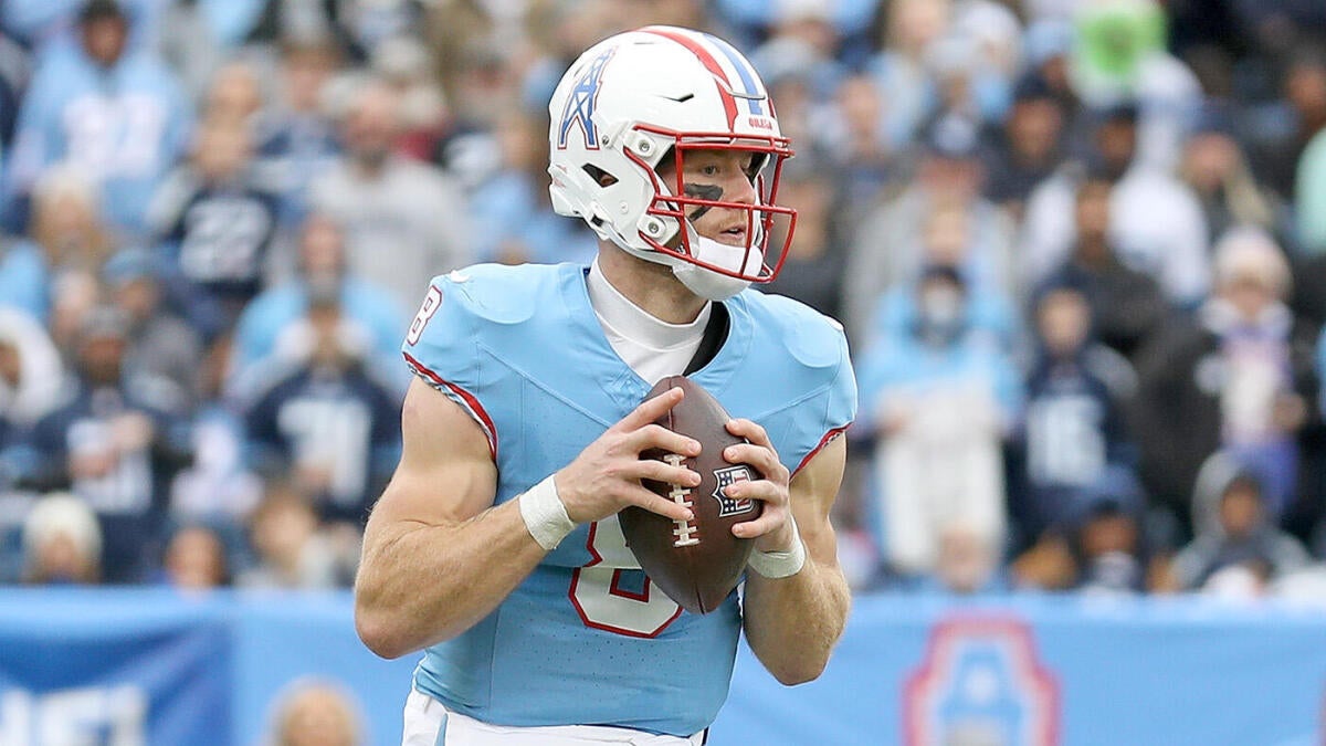
The Houston Oilers throwback jerseys were a tribute to the franchise’s roots, but they carried baggage. Worn only three times (with a 1-2 record), they sparked debate among fans. For some, they were a cherished nod to history; for others, a reminder of the fraught relocation from Houston to Tennessee in 1997. The jerseys became a lightning rod, reigniting tensions between cities and fan bases.
Why Retire Them Now?
The decision to retire the throwbacks isn’t just about aesthetics or performance—it’s about narrative control. By stepping away from a symbol tied to relocation strife, the Titans are signaling a focus on their Tennessee identity. It’s a deliberate pivot: no longer straddling two histories, but committing to one. This isn’t erasing the past; it’s choosing which parts to emphasize.
The Rise of “Titans Blue”: Crafting a Cohesive Identity
The Color That Bridges Eras
“Titans blue” isn’t new. This light blue hue has been part of the franchise’s DNA since the Oilers days, woven into logos, helmets, and alternate uniforms. But elevating it to the primary home color is a statement. It’s a shade that resonates with fans, evoking both continuity (tying the Oilers’ legacy to the Titans’ present) and distinction (setting Tennessee apart from Houston’s deeper Columbia blue).
The Psychology of Color
Color matters in sports branding. It influences fan attachment, player morale, and even opponent perception. Studies suggest lighter blues convey trust and stability—qualities the Titans may want to project after years of mixed results. By standardizing their palette, the team avoids the dilution of multiple blues (navy, Columbia, “Titans blue”) and sharpens its visual identity.
Strategic Motivations: Beyond the Jersey
Fan-Centric Decision-Making
This overhaul isn’t arbitrary. The Titans have listened to their base. Fan forums and social media have long buzzed about preferring “Titans blue” over navy or throwbacks. By aligning with these preferences, the franchise strengthens emotional ties, fostering a sense of ownership among supporters. In an era where fan engagement drives revenue, this is savvy business.
Merchandising and Brand Unity
Uniform changes are revenue engines. New jerseys mean boosted merchandise sales, especially when tied to a compelling narrative (e.g., “a new era”). A unified color scheme also simplifies branding across media, apparel, and stadium aesthetics, creating a more recognizable and marketable team image.
The Ripple Effects: Fandom and Performance
Fan Excitement and Game-Day Energy
Imagine Nissan Stadium awash in “Titans blue” instead of a patchwork of hues. The visual cohesion could amplify home-field energy, making games feel more like communal events. For fans, wearing the same color as the team fosters solidarity—a psychological “us versus them” boost.
Player Psychology
Do uniforms affect performance? Indirectly, yes. Players report feeling more confident in designs they like, and fan support (often linked to aesthetic appeal) can motivate. The Titans’ roster, particularly younger players with no Oilers ties, may embrace a look that’s uniquely *theirs*.
The Road Ahead: What’s Next for the Titans?
Potential Expansions of the Rebrand
Could this extend beyond jerseys? Expect “Titans blue” to dominate more touchpoints:
– Stadium Accents: More blue in end zones, signage, and lighting.
– Alternate Uniforms: Perhaps a “blue-out” alternate or updated helmet designs.
– Community Outreach: Using the color in youth camps and local partnerships to deepen ties.
Long-Term Identity Goals
The 2025 rebrand is a foundation. Future moves might include:
– Logo Tweaks: Refining the fireball emblem to better integrate the blue.
– Naming Rights: If Nissan Stadium’s sponsorship changes, a “Titans Blue Stadium” isn’t far-fetched.
Conclusion: A Bold Step into the Future
The Titans’ 2025 uniform changes are a masterclass in sports branding. By retiring the Oilers throwbacks, they’ve chosen clarity over ambiguity. By embracing “Titans blue,” they’ve united past and present under a color that feels both familiar and fresh. This isn’t just about what players wear—it’s about how a franchise defines itself.
For fans, the message is clear: The Tennessee Titans are no longer looking backward. They’re staking their future on a vision that’s cohesive, fan-driven, and unmistakably their own. When the team takes the field in 2025, the sea of “Titans blue” in the stands will be more than a spectacle; it’ll be a symbol of a franchise finally, fully, coming into its own.